Dashboard card
The easiest way to add the card is I'm ready → Add to dashboard in the Floorplan Editor. You can also add it like any other card: search for Device Floorplan in the card picker.
What a tap does
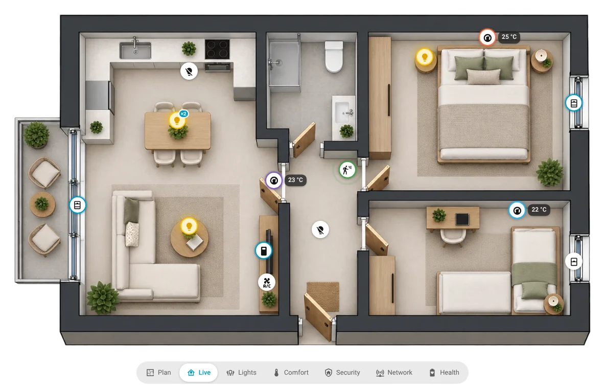
Lights, switches, plugs and fans switch on / off. Covers, locks, ACs and thermostats open their controls (open / stop / close, position, mode, target). Readings open a popup with the last 24 hours. Hold (or right-click) always opens the details. Change it per kind or per device in the card editor.
On the dashboard: calm by design
The card shows your plan and its overlay buttons. That's all there is to do on the dashboard:
| Overlay | What it shows |
|---|---|
| Plan | The plan with your room names. |
| Live | What is happening at home right now: lights that are on (just their glow), switches and plugs that are on, covers while they move, ACs that run, motion (in a room with a shape the whole room gently pulses: a breathing outline while motion is detected, steady for presence, fading out after; open-plan neighbours stay clear. Option Motion as: pulse, icons or both), open doors and windows, unlocked locks, media playing, appliances running. Things that are off are hidden (option: faint), lights can show as markers instead of glow. Shutters appear only while they move; doors, windows and shutters with a drawn opening show as bars instead of markers. |
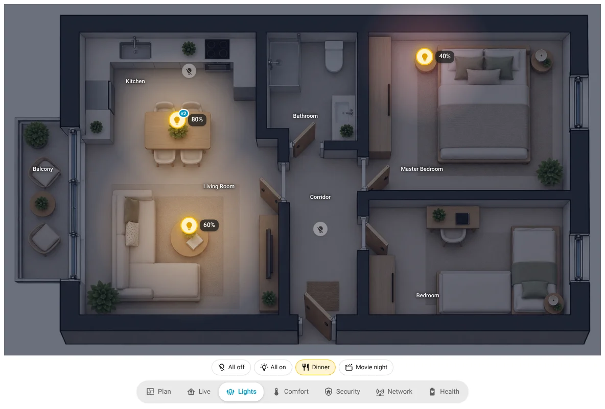
| Lights | Only lights (and switches or plugs that run lights), with a soft light pool where each lamp shines. Tap to switch; All off (asks first), All on and your own light scenes below the plan. |
| Comfort | Room temperature and humidity per sensor, as calm chips (21.0 °C · 69.6 %). ACs and thermostats get a climate chip. |
| Security | Doors and windows, motion, locks, alarm panels, smoke / leak / gas sensors and cameras. Alerts are highlighted. |
| Network | How each device connects (Zigbee, Wi-Fi / LAN, Matter, Bluetooth, Z-Wave), at its box spot for split devices. See Network. |
| Health | Battery levels (red when low) and devices that are offline. |
| People | Each person at the room they are in. Appears once you add people. See People. |
| Your own | Custom overlays you create in the card editor. |
One device, one marker per overlay. Each overlay shows a device once, using one of its entities (the leading one: icon, colour, on/off, tap). Its other sensors are in its popup, or shown as small extra lines if you add them (see Edit markers). The look follows the kind of device everywhere: round markers for lights, switches, doors and motion; the climate chip for ACs and thermostats (compact in Live and your own overlays, full in Comfort); reading chips for temperature and humidity; battery chips.
Close markers spread out side by side so each stays readable; a thin line points to the real spot. Markers get smaller with the card: in a narrow column or the editor's preview they scale down instead of covering the plan.
Tapping
| Tap on | Does (default) |
|---|---|
| A light, switch, plug or fan | Switches it on / off (bonds: all of them) |
| A cover (blind, shutter, garage door, gate) | Its controls: open / stop / close and the position. Bonded covers: each one plus All |
| A reading (temperature, humidity, battery) | A popup: each reading with its value and the last 24 hours |
| An AC, thermostat or lock | Home Assistant's controls |
| A phantom | Its devices with their values (and a graph for readings) |
| A device in Network | Its connection, role, signal, the path to the coordinator and the devices connected through it |
| A person | Home Assistant's details of the person |
| Anything else | Home Assistant's details (more-info) |
What works with what
| All integrations | Signal sensor enabled | ZHA + admin user | Zigbee2MQTT | Users without admin rights | |
|---|---|---|---|---|---|
| States, values, taps, popups | ✓ | ✓ | ✓ | ✓ | ✓ |
| Connection icon in Network | ✓ | ✓ | ✓ | ✓ | ✓ |
| Signal in the popup (dBm, %, LQI) | ✓ | ✓ | ✓ (linkquality sensor) | ✓ | |
| Zigbee roles, LQI ring, links, path | ✓ | not yet | |||
| N new · Place them hint | admins only |
Several floors
A card can show several plans: at the top of the card editor, floor tabs 1 · 2 · + like Home Assistant's stack editors, each tab one plan from the Floorplan Editor. The card opens the first floor (or the one you last looked at on that screen).
On the card a round floor button sits right next to the Layers button, on its right (with one floor, Layers keeps that spot), with the floor's level from Home Assistant as a badge (0, 1, -1…). Tap it: it turns into a slim floor rail opening towards the plan (▲ · floors, highest on top · ▼); pick a floor and it folds back into the button. Swipe up / down on a touch screen also changes floors. The plan always keeps its full width.
Switch floors from other cards too: floor: in the action, or ?floor=first_floor in a link (see below).
Network
- Icon = connection: Zigbee, Wi-Fi / LAN, Matter, Bluetooth, Z-Wave. No values on the plan; the signal is in the device's popup.
- Colour and shape = role: coordinator (amber diamond), router / repeater (blue square), hub or bridge (blue square), end device (green), other devices (grey), unavailable (red).
- Ring = Zigbee link quality: 0–99 red, 100–149 orange, 150–199 yellow-green, 200–255 green. It comes straight from ZHA; you don't need to enable any LQI sensor.
- Lines: Zigbee links between placed devices (ZHA), coloured by LQI, and dashed lines from devices to their hub or bridge.
- Links to another floor: a device here whose router, coordinator, access point or hub is on another floor shows that device faded at its spot from its own floor, with a normal line. Hover it for its name and floor. For Zigbee this is shown for devices without a router next to them on this floor, with their strongest link. It works best when your floor plans line up (same outline and scale).
- Wi-Fi / LAN from your router: with a router integration that tracks network devices and reports the access point (FRITZ!Box: Configure → device tracking on), each Wi-Fi / LAN device gets a line to the router or repeater it's connected to: solid = cable, dotted = Wi-Fi, one colour per access point. The router and repeaters are found by name among the devices on your plan and show as diamonds (Router / access point). The legend counts the devices per access point (FRITZ!Box: 30 Wi-Fi, 6 cable), the popup shows the access point, cable or Wi-Fi, the Wi-Fi network and the IP. The ring is the device's own signal sensor (good / fair / weak), when it has one.
- Legend under the plan: tap a role to hide or show it, tap an LQI range to hide or show its Zigbee links, Refresh reloads the Zigbee data (the time of the last update is next to it; it also refreshes by itself every few minutes while Network is open).
- Layers: show several connections at once (Zigbee + Matter, for example) or Default, lines and legend on or off. Only what applies to the connections shown is offered: with just Wi-Fi / LAN there's no Zigbee links, LQI or Refresh. What a viewer picks is remembered on that screen.
- Popup: connection, role, LQI / RSSI, the path to the coordinator, and Connected devices: for a router, the Zigbee devices that connect through it; for a hub or bridge, the devices behind it. Tap one to highlight it on the plan.
Climate chips
ACs and thermostats get one chip: the mode as a word and colour (Cooling blue, Heating orange, Dry / Fan teal, Off grey and dimmed), the target (Set 24°) under it, then the room temperature large with the humidity under it. It uses what the unit reports: Idle when the mode is on but it isn't running; no humidity (or 0 %) → no humidity line; no target → no Set line. On a narrow card only the icon and the numbers stay.
Temperature and humidity readings use the same look as the right half of a climate chip: the temperature large, 💧 68% small under it.
Bonds, phantoms and split devices
A bond is always one marker, with the bond's name from the Floorplan Editor (no badge on the card: it is one device). Its value is combined: lights 2 of 3 in the popup, sensors one chip with the average, batteries the lowest. A phantom looks like any other reading or marker; its devices keep their own markers and its popup lists them. A split device shows each placed entity where it acts; Network and Health show the device at its hardware spot.
For sensors you choose how a combined value shows: Comfort → Bonds and phantoms with several sensors show average, lowest or highest (default for all), or per bond / phantom in the device list (Value on the plan, including one sensor). The popup shows the combined value large and every sensor below it.
Day & night
At night the plan darkens and the lights that are on glow where they are, in their own colour and brightness.
Card editor → Day & night:
| Setting | Default | What it does |
|---|---|---|
| Day & night | Follow the sun | Follow the sun: daylight until sunset, then gradually darker until the sun is 6° below the horizon (and the other way round at dawn). Fixed times: night from Night starts to Night ends, with a 30-minute fade. Follow Home Assistant's dark theme. Always night. Off. |
| Night starts / ends | 20:00 / 07:00 | For Fixed times, and for Follow the sun while the Sun integration is missing. |
| Use the night look in | Plan, Live, Lights, People | Readability first: Comfort, Security, Network and Health stay in daylight unless you add them. Custom overlays can be added too. |
| How dark the night gets | 70 % | |
| Style | Moonlight | Deep blue, or Dim (darker, neutral). |
| Dim quiet markers at night | On | Markers that are off or idle get softer; active ones (a lamp on, motion, an open door) stay bright. |
| Closed shutters darken their room by day | On | Daylight spreads through rooms with a shape: a window always lets light in, a shutter by how far it's open (electric ones by position, manual ones by their contact), doors don't count. A room without windows or shutters takes the average of the rooms its shape touches or overlaps; a gap between shapes is a wall. Fully dark is about half dark, never black, and rooms blend softly into each other. See openings. |
| Warm dusk and dawn colours | Off | With Follow the sun: a warm tint at dusk and a soft blue one at dawn while it changes. |
When every room on the plan has a shape, only the inside of the home darkens at night: walls and everything outside keep their colour, so the card stays calm next to your other cards.
Doors, windows and shutters with a drawn opening show as bars in Live and Security: a light blue bar for an open door or window, a white outlined bar for an open shutter (electric ones filled as far as they are closed, fading out a moment after closing). Tap a bar for its details and controls.
Room names turn light at night and stay readable; markers and chips are never darkened by the night layer. The shape of each light pool comes from the Floorplan Editor (light shapes); without one, a lamp is a bulb of about 1.5 m. In the Lights overlay the pools also show during the day, softer.
No Sun integration?
Add it under Settings → Devices & services → Add integration → Sun for the gradual change. Until then the fixed times are used.
People
Card editor → People → Add person:
- Person: the person entity (picture, home / away).
- Room sensor 1: any entity whose state is a room: Bermuda's Area sensor, ESPresense, a room-presence or template sensor, a phone's area sensor.
- Room sensor 2: used when sensor 1 is unknown or reports a room that isn't on this plan (e.g. sensor 1 = watch, sensor 2 = phone).
The state is matched to a room pin by the area's name, its id or one of its aliases. The person's picture (or initials) sits at that room's pin; several people in one room sit side by side.
| Situation | On the card |
|---|---|
| Home, room known | Avatar at the room pin |
Room sensor reports low confidence (attribute confidence below 0.5 / 50 %) | Avatar faded, dashed |
| Home, no room known | In the Home row under the plan (People overlay) |
| Away | Not shown |
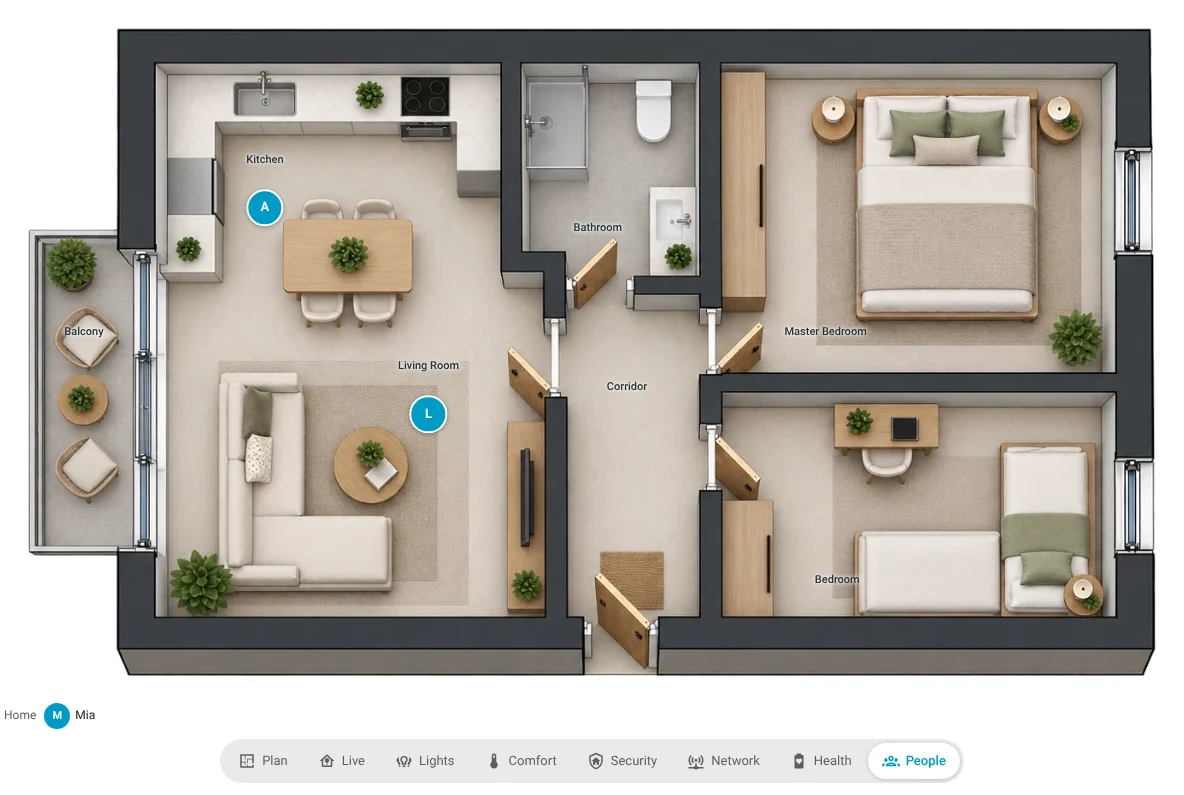
Also show people in these overlays adds the avatars to Live (or any other overlay).
In the card editor: everything adjustable
Open the dashboard's edit mode and edit the card. It has two parts:
Per floor, in a frame with the floor tabs: for the floor you picked, Markers (the Edit markers button) and Rooms on this floor (custom Room names, Rooms hidden on the card). Nothing else depends on the floor.
Card settings (the whole house, all floors): the floor the card opens with and swiping · title and card ID · Overlay buttons on the card · Overlays (each built-in overlay, Light scenes, Custom overlays) · Rooms (how names look, where they show) · People · Day & night · Look and tap behaviour. Overlays are the same on every floor.
Overlay buttons on the card: which ones and in which order (drag), the one shown when the card opens, where the buttons are (below, above, left or right of the plan, or hidden) and their style (icons and labels, or icons only). Overlay names renames them.
Live: which kinds of devices it shows, things that are off hidden (default) or faint, values next to icons, lights show as glow only (default: no light markers, lights that are on just glow, tap the glow to switch off; switch lights on in the Lights overlay) or markers.
Lights: switches and plugs that run lights, brightness of lamps that are on, lamps that are off (faint, normal or hidden), All off / All on buttons.
Comfort: humidity, humidity-only devices, ACs and thermostats as climate chips, how bonds and phantoms combine sensors.
Security: also closed / idle, cameras.
Network: connections shown by default, the Layers button, Zigbee links and their minimum LQI, hub links, Wi-Fi / LAN links, legend, connection names next to icons, only weak signals.
Health: low-battery threshold, only problems.
Tap behaviour per kind: switch on/off, details, readings popup or nothing.
Look: marker size (at full width; smaller cards scale down), markers with icon and text or icon only, reading chips (dark glass, light, follow the theme), device names, title.
Edit markers
The Marker Editor opens the card full-screen. Two ways in:
- ✎ Edit markers in the overlay button bar, while the dashboard is in edit mode (panel and masonry dashboards). Changes are saved to the dashboard right away.
- Edit card → Markers → Edit markers (on the floor picked in the tabs): works on every dashboard. On sections dashboards Home Assistant doesn't let you click inside cards in edit mode, so the card shows a small hint pointing here. Press Done, then Save in the card editor.
Pick an overlay with the buttons under the plan: everything you change applies to that overlay.
- Click a marker: its settings open at the top of the right panel, and a red ✕ appears on it (✕ hides it in this overlay).
- Leads in ‹overlay›: which entity the marker uses for its icon, colour, on/off and tap. Automatic picks the one that fits the overlay (e.g. a presence sensor's overall presence in Security).
- Also show: add any readings of the device as small lines under the marker, e.g. a 3D printer: Printing · 1 h 20 min left · AMS 38 %. Back to automatic undoes it. Each line can get its own icon (click the icon in front of it), and one line can be a badge on the marker's corner instead (○ → ●), e.g. the number of people a presence sensor counts. Show an icon off shows only the values.
- Icon and Tap in this overlay, Name on the card (all overlays), Value on the plan (bonds and phantoms with sensors), Shows in for every overlay.
- The list below: search, then
- Hidden here: markers you hid, each with ↩ Show;
- On this overlay: click one to select it;
- Not in this overlay: in your own overlays with + Add. A device always appears at its spot from the Floorplan Editor; devices not on the plan yet are placed there first.
- People: click a person for their person, room sensors and the overlays that show people.
Bonds list the entities of all their members (All lights together, Average temperature and so on are the automatic choices). Phantoms always show their combined value.
Light scenes
Under Light scenes, Add scene: a name, an icon, the lights, and a brightness (0 = off). Or set the lights the way you want them and press Save the lights' current state: on / off, brightness and colour of each light are kept. You can also run a Home Assistant scene or script instead. The scene buttons appear in the Lights overlay; the active one is highlighted. Scenes are stored in the card only.
Rooms
Room names placed in the Floorplan Editor (step Rooms) show on the Plan overlay. Choose the overlays they appear in, the style (text, text on a chip, chip with the room's icon) and the size; rename single rooms under Custom room names, or hide them for the card.
Custom overlays
Under Custom overlays, Add overlay: a button name, an icon, and which devices:
- By kinds: tick the kinds it shows (lights, covers, doors and windows, temperature, humidity, battery…) and put them in order: for each device the first kind it matches leads (its look and tap), every other ticked kind it matches becomes a small extra line. With Lights · Temperature · Humidity · Battery a lamp shows as a light, a thermometer as 21.4° with 💧 55 % and its battery under it. New devices of those kinds join automatically.
- Only devices I add: starts empty; add devices in Edit markers (+ Add). Good for Plants or Kids' rooms.
Lights show as markers or glow only, as in Live. Per device, Edit markers always wins.
Switch the overlay from other cards
Use this when the card is part of your own dashboard, for example a wallpanel with a top row of chips: tapping a chip shows the matching overlay. The simplest way is the chip card, which also glows for the overlay that's showing. Set the overlay buttons to Hidden if you only want to switch from outside.
Overlay names: plan, live, lights, comfort, security, network, health, people, your custom overlays' IDs (e.g. custom1), or reset (back to the card's default overlay).
1. The action (every screen)
Give the card a Card ID in the editor, e.g. hall. Then any button, chip, script or automation can call:
action: device_floorplan.show_overlay
data:
  card_id: hall
  overlay: comfort
  floor: first_floor        # optional: also switch the floor (plan id, name or level)
Every screen showing that card switches: the wallpanel and your phone together.
A Tile card in your top row:
type: tile
entity: sensor.indoor_temperature
tap_action:
  action: perform-action
  perform_action: device_floorplan.show_overlay
  data:
    card_id: hall
    overlay: comfort
An automation that shows Security on the wallpanel when the alarm is armed:
triggers:
  - trigger: state
    entity_id: alarm_control_panel.home
    to: armed_away
actions:
  - action: device_floorplan.show_overlay
    data: { card_id: hall, overlay: security }
2. A link (this screen only)
Navigate to the dashboard with ?overlay= (and / or ?floor=) in the address. Only the screen you tap on switches. It applies every time you tap, and the card removes the parameters from the address afterwards:
tap_action:
  action: navigate
  navigation_path: /wallpanel/home?overlay=network&floor=G
With several floorplan cards on one view, add &card=hall so only that card switches.
Inside your own dashboard layout
Want the floorplan inside a bigger design, such as a wallpanel with its own menu rail next to the plan? Put it in one of Home Assistant's own stacks (horizontal stack, vertical stack, grid) and shape the layout with card-mod on the stack.
Why a stack and not a Button-Card field?
Home Assistant opens a card's visual editor only for cards it can reach: on the dashboard itself or inside its stacks and grid. A card placed in a custom field of another custom card (Button-Card, for example) only offers the outer card's YAML, and the ✎ Edit markers pen can't reach it either. In a stack: Edit the stack → Show visual editor → pick the floorplan's tab, and the full card editor, including Edit markers, is there.
An example: a panel with a menu rail (1 part) and the plan (8 parts), one gradient background for both, and the floorplan blending into it. The rail buttons switch the plan's overlays with the device_floorplan.show_overlay action, so the card's own overlay buttons are hidden.
type: horizontal-stack
grid_options:
  columns: full
  rows: auto
card_mod:
  style: |
    :host {
      display: block;
      box-sizing: border-box;
      min-width: 0;
      background: linear-gradient(160deg, rgba(42,52,72,0.95) 0%, rgba(22,24,30,0.98) 70%);
      border: 1px solid rgba(90,169,255,0.18);
      border-radius: 14px;
      padding: 8px;
      overflow: hidden;
    }
    #root {
      display: grid !important;
      grid-template-columns: minmax(0, 1fr) minmax(0, 8fr);   /* rail : plan */
      column-gap: 8px;
      align-items: center;
    }
    #root > * {
      min-width: 0 !important;
      width: 100%;
      margin: 0 !important;
    }
cards:
  # Left: the menu rail
  - type: vertical-stack
    cards:
      - type: button
        name: Home
        icon: mdi:home
        tap_action:
          action: perform-action
          perform_action: device_floorplan.show_overlay
          data: { card_id: panel, overlay: live }
      - type: button
        name: Lights
        icon: mdi:lightbulb-group-outline
        tap_action:
          action: perform-action
          perform_action: device_floorplan.show_overlay
          data: { card_id: panel, overlay: lights }
      - type: button
        name: Comfort
        icon: mdi:thermometer
        tap_action:
          action: perform-action
          perform_action: device_floorplan.show_overlay
          data: { card_id: panel, overlay: comfort }
      - type: button
        name: Security
        icon: mdi:shield-home-outline
        tap_action:
          action: perform-action
          perform_action: device_floorplan.show_overlay
          data: { card_id: panel, overlay: security }
  # Right: the floorplan, without its own frame
  - type: custom:device-floorplan-card
    plan: ground_floor
    card_id: panel
    buttons: { position: hidden }
    card_mod:
      style: |
        :host { display: block; min-width: 0; }
        ha-card {
          background: transparent !important;
          border: none !important;
          box-shadow: none !important;
}- Change
planto your plan's id and keep the samecard_idin the card and in the buttons. - Any card works in the rail: chip cards (they also glow for the overlay that's showing), Tile, Button-Card, Mushroom… Only the floorplan itself needs to sit directly in the stack.
- Prefer the card's own overlay buttons? Leave out
buttons: { position: hidden }and the rail. - Card-mod styles on the floorplan card stay in place when you switch overlays. Put the layout (grid, background) on the stack, as above: the stack doesn't redraw, so the layout holds.
YAML
Everything the editor sets is plain YAML; only what differs from the defaults is stored.
type: custom:device-floorplan-card
plans: [ground_floor, first_floor]  # or plan: ground_floor (one floor)
title: Home
overlays: [live, lights, comfort, security, people, custom1, plan]
default_overlay: live
overlay_names: { live: Home }
buttons: { position: left, style: icons }     # bottom | top | left | right | hidden
live: { show: [lights, motion, openings, climate] }
lights:
  brightness: true
  all_on: true
  scenes:
    - name: Movie night
      icon: mdi:movie-open-outline
      lights: [light.sofa, light.tv_strip]
      brightness: 20
comfort: { humidity: true, combine: average }   # average | min | max
network: { connections: [zigbee, matter], min_lqi: 80, legend: true }
health: { low: 25, only_problems: true }
rooms: { show_in: [plan, comfort], style: pill, size: m, names: { kitchen: Kitchen & dining } }
people:
  - { entity: person.anna, room: sensor.anna_watch_area, room2: sensor.anna_phone_area }
people_in: [live]
night: { mode: sun, start: "20:00", end: "07:00", overlays: [plan, live, lights, people], strength: 70, style: moon, dim_quiet: true, shutters: true }
custom_overlays:
  - { id: custom1, name: Downstairs, icon: mdi:stairs-down, kinds: [lights, covers] }
tap: { cover: more-info, reading: readings }
look: { size: 38, chips: auto, markers: icon, names: hover }
devices:
  <device_id>: { icon: mdi:ceiling-light, name: Dining, tap: toggle, hide_in: [security], add_to: [custom1] }
  <printer_id>:                                  # per overlay: lead, extra lines, icon, tap
    per: { live: { lead: sensor.p2s_print_status, extras: [sensor.p2s_remaining_time, sensor.ams_humidity] } }
  bond:<bond_id>: { value: max }              # bonds and phantoms (ph:<id>): average | min | max | one (+ one: sensor.x)
card_id: hall
Older configurations (plan, show_states, names, default_view, look.dock, look.values) keep working.
Admins see a small N new · Place them button when new devices are waiting. Hide it with hide_admin_hint: true, or the card editor's Hide the “N new · Place them” button.